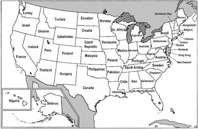
Here is an interesting map from Freakonomics (via FP Passport) comparing the Gross Domestic Product (GDP) of states with countries. (Gross Domestic Product represents the annual market value of all goods and services produced within a country in a year or, to be more precise, consumption + investment + government spending + [exports – imports].) The states on the U.S. map are renamed for the country that has a similar GDP. You can find the specific stats state-by-state here.
This was obviously put together by someone with a lot of time on his or her hands.

1 comment:
Does this mean that country, western, and other singers and bands need to make a pilgrimage to Nashville (in Saudi Arabia) at least once in their lifetime?
Post a Comment